When working on developing and optimizing products, we usually know the high-level metrics that govern business results, like Conversion Rate for e-commerce, or Monthly Recurring Revenue for subscription-based products.
We tend to use them as team or initiative objectives, which sounds logical considering that we expect to build things to grow the business. The problem is that there are hundreds of variables affecting those metrics, and using such “generic” goals prevent us from really understanding the impact the product teams are making.
It is more useful to use “lower-level” metrics that accurately reflect the team’s impact or the problem they are solving. For instance, for a team in AirBnB, improving the description page of properties in a particular region, instead of using “increase conversion” we can go for “increase ratio of users going from detail page to checkout for properties in this region”. Instead of watching for a 0.0002% increase in overall conversion, we can expect a 10% increase in the step for that region.
But this is a simple illustrative example. Setting powerful goals for a team or an initiative, without using generic high-level indicators, usually is a complex task. Luckily, we can use a few tools to help us with this task.
Tool1 — Metrics Frameworks (the basics)
To start, there are multiple models to structure and think about the metrics of your products from a high-level perspective. Let’s see a few popular ones. As any model, they will be incomplete for your needs, but consider them a starting point to keep exploring and adapting.
Pirate metrics — AARRR
Pirate metrics were first introduced by Dave McClure and gained traction among tech SaaS startups. It stands for:
- Acquisition: where are users coming from? What are our best channels?
- Activation: how many users are making the first conversion? Sign up, start free-trial, etcetera.
- Retention: how many users are coming back and keep using the product?
- Referral: how many users are “inviting” others to test the product?
- Revenue: how many users are becoming paying customers?
The model is simple and it’s meant to be adapted to your product’s customer journey. We can generalize it even further, considering that we are measuring the ratios of each of the key user activities in our service.
Conversion Funnel
The conversion funnel is a simple and well-known model to analyze users’ progress towards a conversion, usually related to the purchase of a product. The typical cone-shaped visualization shows the ratio of users that “micro-converts”, passing from one step to the next in the purchase process.
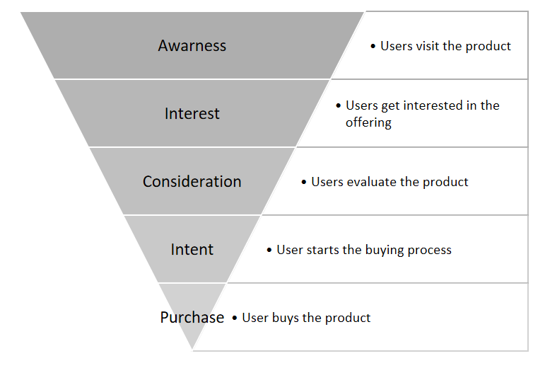
As experiences become more complex, the funnel fails to measure the real customers’ purchase journey and need to be expanded and adapted.
Heart and signals
A few years ago Google proposed this framework consisting of five categories of metrics to help analyze a product’s UX (but really going beyond the experience).
- Happiness: how satisfied the users are with the product, or what is their perceived attitude towards using it.
- Engagement: how active they are with the product, what behaviors show us their involvement.
- Adoption: how many customers are starting to use a product or feature.
- Retention: rate of returning users (as in AARRR metrics).
- Task success: typical activity-based metrics as efficiency and error rates.
While useful for many types of KRs, this framework can be particularly useful if focusing on UX related problems.
3 games of customer engagement
Another good model to recognize what are the most important metrics for your product is understanding what Amplitude calls the “games of engagement”: attention, transactions, or productivity.
Attention focus companies like Netflix must use metrics like “time spent”. In contrast, transaction companies like Amazon would look at purchases per visitor. And finally, productivity products would look at activities performed within the product, such as the number of records processed per session.The Three Games of Customer Engagement Strategy
This article is the third in our north star metric series. This series unpacks a modern approach to product management…amplitude.com
Tool 2 — KPI Trees
Beyond the frameworks or metrics you use, a critical element that I always use to define powerful KRs is to explore which “sub-metrics” will impact your desired outcome. For example, if you are considering Revenue, it is a result of multiplying the Number of Visitors by Conversion rate and Average sell rate. Grow any of these figures and revenue will increase. In turn, the Average Sell Rate is formed by multiplying the Number of items in the order and the Average price per item. Conversion rate is composed of multiple step-by-step conversion rates in the funnel (see figure 3.3.5).
KPI Trees help us visualize this composition.
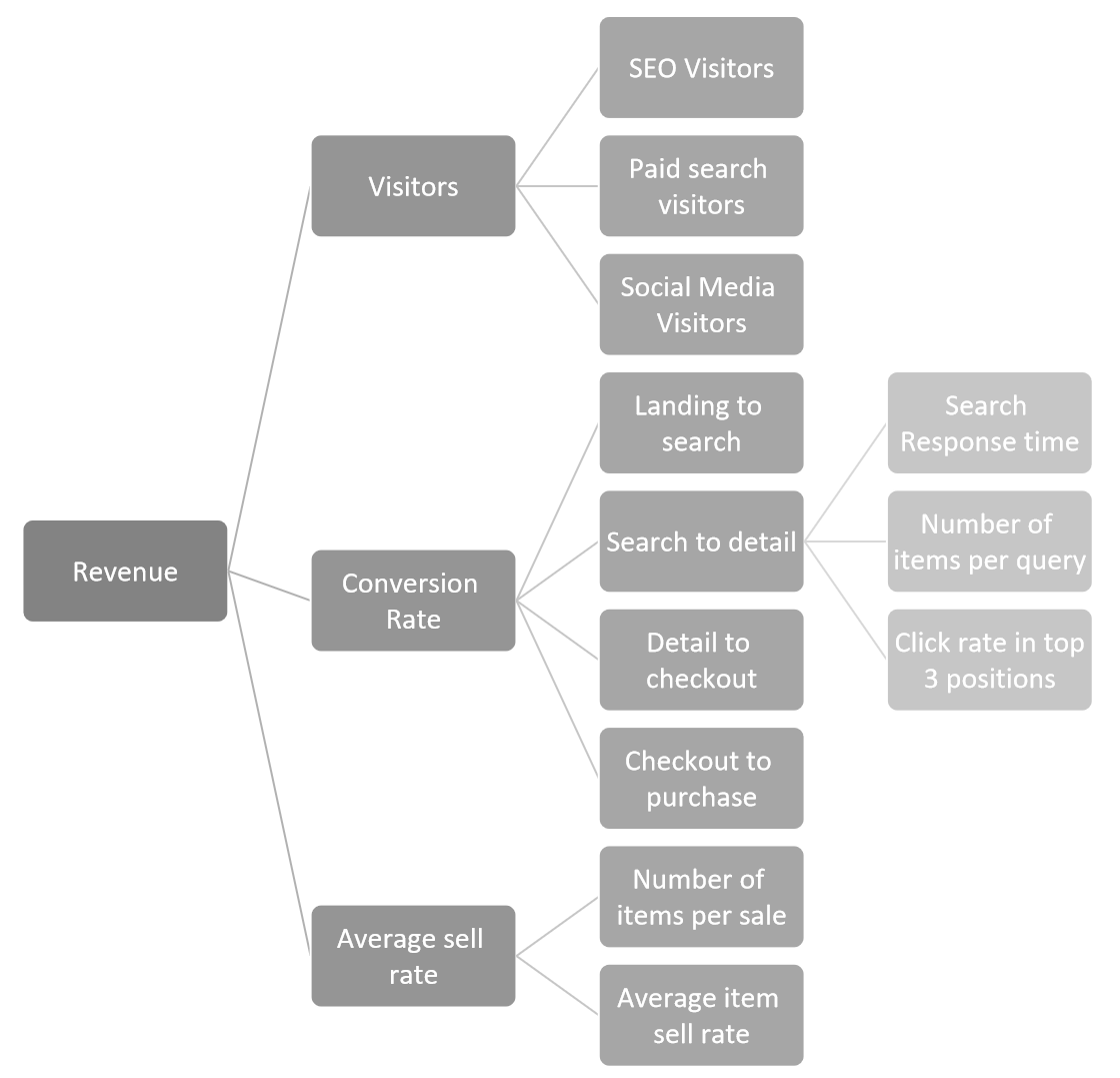
Teams should make sure they are using the Key Result that is most specific to the problem they are trying to solve. For example, if you are improving the search results page’s sorting algorithm, Conversion Rate will be the ultimate desired outcome, but “Click rate in top 3 positions” is a more precise indicator of the problem you are trying to solve.
Selecting a metric to use in your KRs may happen by decomposing a more general desired outcome (as just described in the conversion rate example), or in the opposite way by detecting an opportunity that impacts a low level metric that we can then match with a higher level result. For example, if we identify a low number of users clicking on the first positions of our search results page, we have the opportunity to improve the search algorithm and impact the “Click rate in top 3 positions”. With the KPI tree, we can make sure we analyze all indicators and how they link to the company’s strategic goals.
Tool 3 — Leading indicators
Another way to think about sub-metrics is to find leading indicators: those measures that, if affected today, can impact future desired outcomes.
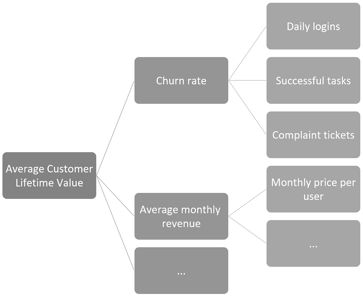
Consider the desired outcome for a SaaS product of:
- Increasing the average Customer Lifetime Value (CLV).
This is a lagging indicator of our product improvements. It can take a long time to evaluate changes in lifetime value. On the other hand, we can say that the Churn rate affects the average lifetime value since we will extend the average active period of users if we reduce it. Churn changes are still hard to measure after each product improvement. We can, however, find leading indicators for churn rate, such as:
- Increased daily logins (decreases churn)
- Increased amount of successful tasks (decreases churn)
- Increased amount of customer “complaint” tickets (increases churn)
These last metrics are much easier to measure from one iteration to the next, creating faster learning loops and allowing teams to have more reliable quarterly measures of their impact.
By finding leading indicators of the problems to solve, teams can learn much faster if they are progressing towards the desired outcome.
It is worth mentioning that when teams select a leading indicator, they assume that it will change the ultimate desired outcome. For example, we believe that by improving onboarding, we will reduce churn. But if the product is not valuable for the user, he or she won’t stay, no matter how good we make the onboarding. We are generating a gap, within which teams may achieve their goals (“improve onboarding”) while the company doesn’t (no impact on “churn rate”). Given the value of using sub-metrics to measure teams’ impact, this is a risk worth taking.
This content was adapted from Product Direction, my upcoming book, describing at length, with examples and templates, the process to successfully create and link the Product Strategy, Roadmaps, and OKRs.
You can download here a pre-launch free section and join the waitlist.